Posts in Room Reveals
Room Reveal: Poolside Refresh with Frontgate

This summer we partnered with Frontgate to refresh our poolside patio and I'm excited to share the transformation with you! 

We’ve enjoyed our Carlisle outdoor furniture for almost ten years. To that end, I must highlight that Frontgate's quality and customer service, is absolutely top notch. The level of detail they consider when crafting their products is evident. From the prints lining up on the cushion ties, to the furniture still looking beautiful after withstanding a decade of Michigan elements, when you purchase FG furniture, you can relax in knowing that the pieces are as durable as they are easy on the eyes. 

So while the pieces themselves were still in fine form, our original yellow and green color scheme was feeling a bit tired. Coupled with the need for new barstools, our outdoor area was begging for a new lease on life!

Here's a look at the before:

To create our outdoor oasis, we went for a classic navy & white resort vibe. I’m so happy with the crisp stripes and in knowing this timeless design will always feel fresh!

Here’s some additional peeks at the transformation:

JanaBek_Frontgate-6 copy.jpg


For the full reveal, and my top tips to entertain with ease outdoors, head on over to Frontgate’s blog!


Photos by Marta Perez


One Room Challenge - THE Kitchen REVEAL

If you’re here for the first time, welcome! I’m Jana Bek, an Ann Arbor based interior designer with an emerging lifestyle line of home décortextiles, & lighting. I have a love for bright colors, bold prints, and designing spaces & home décor that help transport you to your dream destination.

I’m so excited to be participating in my fifth season of One Room Challenge & and a huge thanks to Linda of Calling it Home for organizing!

I’m so thrilled to share our kitchen reveal with you – the space is finally in line with the bright & airy aesthetic of our home! A big thanks to Marta Perez for capturing it so beautifully!

Let's recall the before:

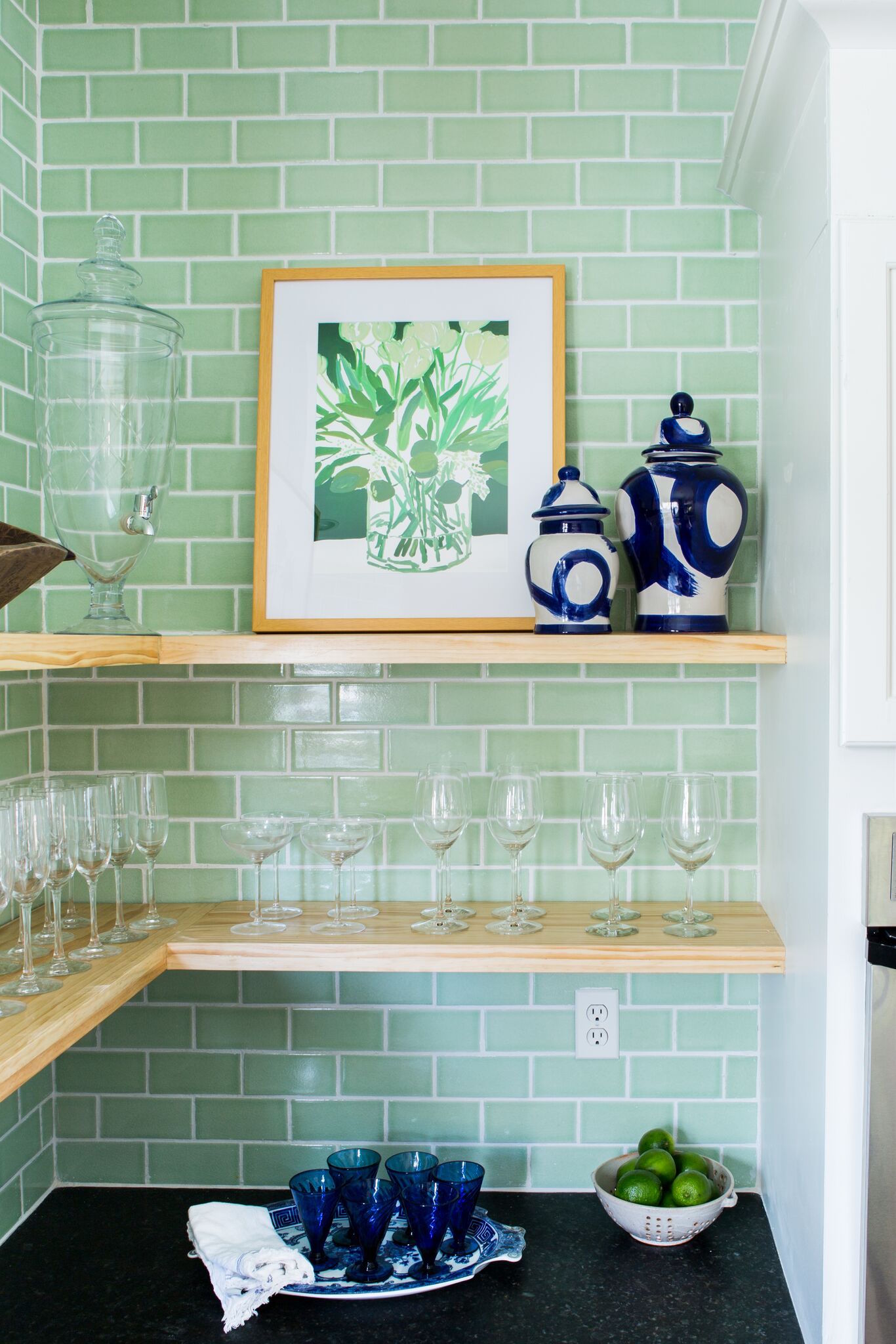
The stunning Fireclay tile completely transformed the space, taking it to the ceiling made such a huge impact! The kiwi color really is the happiest shade of green.

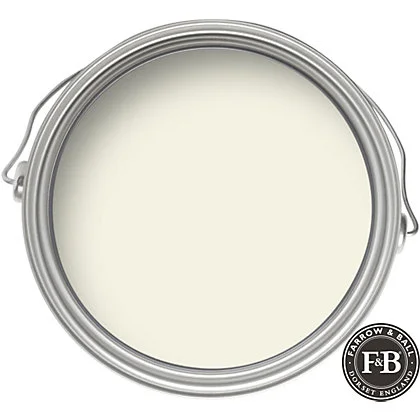
We painted the cabinets Farrow & Ball’s James white, the shade has just enough warmth to compliment the green tones throughout the space, it’s a beautiful color. (This was our painter’s first time using F&B paints, he concluded it was the best paint he’s ever used). 

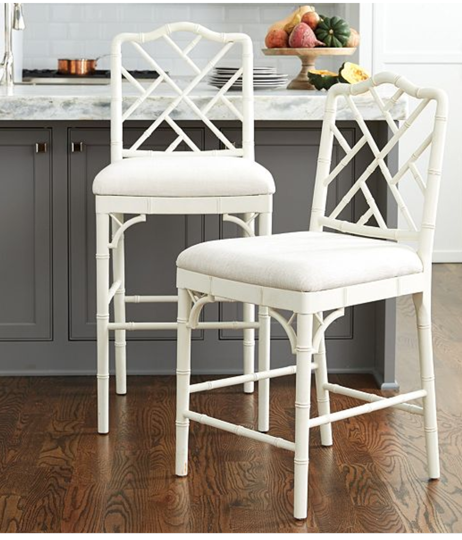
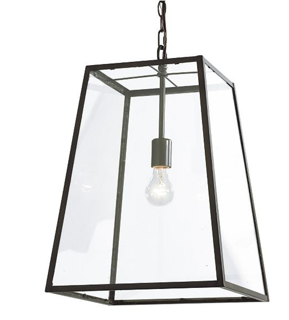
The Eldridge pendants set off the space beautifully, and our Dayna counter stools reinforce the coastal vibe I’m always after. 

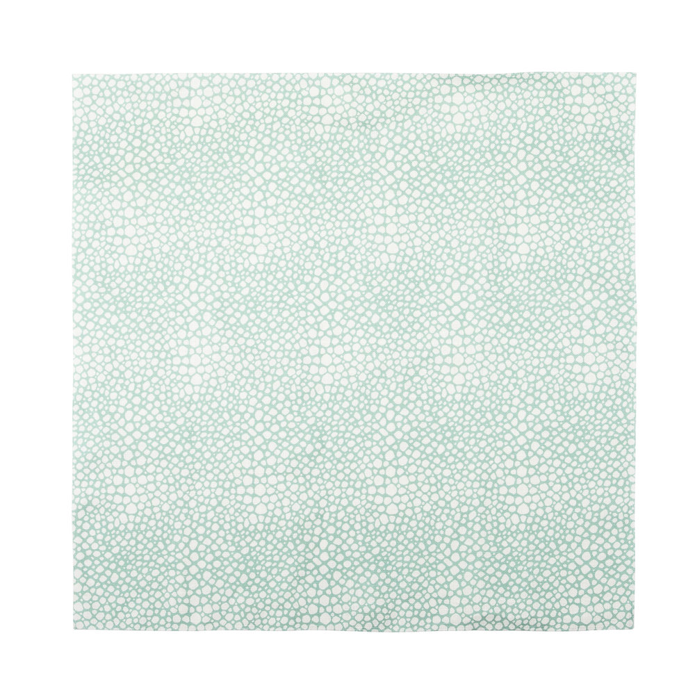
I reupholstered the stool cushions in our aqua Shagreen fabric to add more color, I love how it compliments the tile!

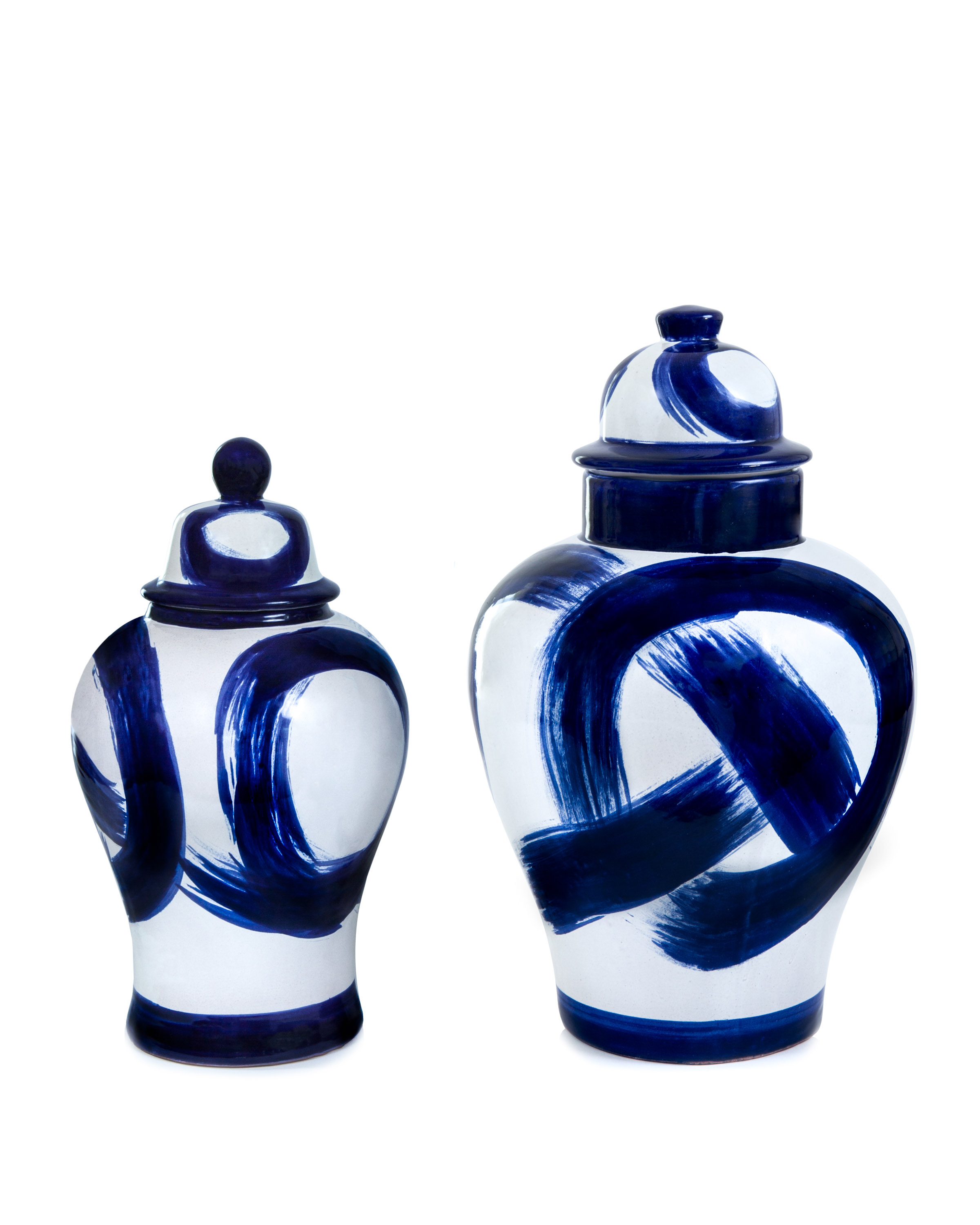
To add character & interest into the shelves, I layered in artwork and vintage finds.

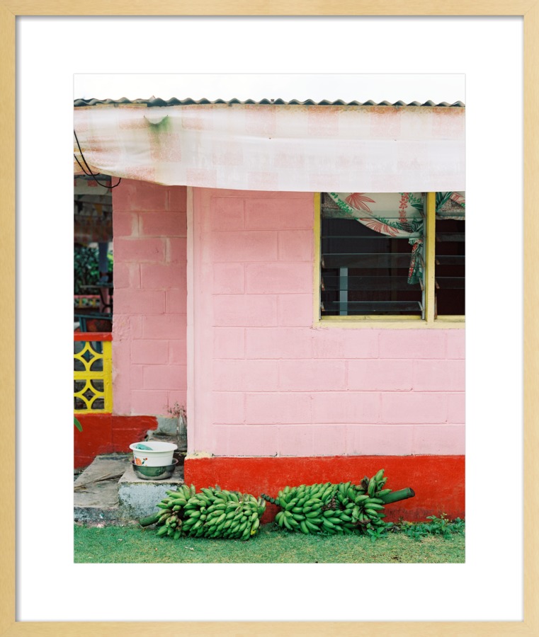
I especially love the colors in the Bananas’s Ripening & Tzealim pieces.

The space is so inviting, it’s such a happy place to cook & congregate!

unspecified.jpg

Photography by Marta Perez

Thank you for following along on my ORC, to keep up with my designing and new product launches, be sure to follow us Instagram & Pinterest!

GET THE LOOK


ONE ROOM CHALLENGE Week V - Exciting Announcement!

If you’re here for the first time, welcome! I’m Jana Bek, an Ann Arbor based interior designer with an emerging lifestyle line of home décortextiles, & lighting. I have a love for bright colors, bold prints, and designing spaces & home décor that help transport you to your dream destination.

I’m so excited to be participating in my fifth season of One Room Challenge & and a huge thanks to Linda of Calling it Home for organizing!

This round, I’m taking on our kitchen, it currently has a dark 90s dated look, that's completely out of sync with the airy spaces that surround it.

We are in the final stretch & we are thrilled with how it’s coming together! We’ve only got two items left to finish; the floating shelves and building up the top of the fridge.

The original plan was to paint the floating shelves white but when the cut shelves were set in place, I loved the texture and warmth that the natural wood provided. It’s not a high-end wood but I don’t care as the color is exactly what I would have chosen (aka it’s Pine & it’s fine)!


Secondly, I’ve always been disturbed by the header on our fridge. It wasn’t that it didn’t reach the ceiling (with 10’ ceilings that didn’t bother me so much) but the trim looked so wimpy. Since we were painting anyway, we are building up the height of the header about 8” then adding a classic 4” crown molding. Here’s where we are at now, and an inspiration photo of the process I found on Pinterest, original image can be found here. I know it will look so much more substantial!

IMG_4923.jpg

Now for the final touches, including an exciting announcement, that will really bring the space to life!

If you follow me on Instagram or have read previous blog posts you know that I am an avid art collector & enjoy discovering new artists. So I’m delighted to share that I’m now offering a curated selection of my favorite Artfully Walls pieces on the site!

I've long been a fan of AW , below is Boy on Horse by Andrew Jacona & Three Palms by Jan Weiss in our home & Atlanta apartment:

To add interest & color to the kitchen, I’m excited to layer these works onto our floating shelves:

11118-900-1493190049.jpeg

Clockwise from top right:

Bananas's Ripening / The Almond FlowerEmeraldA Child's PlayTzealim

We are a bit behind schedule so wish us luck & I hope you’ll tune in next Thursday for the big reveal!

In the interim, you can find my scheming on Instagram & pinterest.

Be sure to follow along with the Wednesday group below with my fellow linking participants!


ONE ROOM CHALLENGE - ANN ARBOR KITCHEN MAKEOVER - Final Stretch

If you’re here for the first time, welcome! I’m Jana Bek, an Ann Arbor based interior designer with an emerging lifestyle line of home décortextiles, & lighting. I have a love for bright colors, bold prints, and designing spaces & home décor that help transport you to your dream destination.

I’m so excited to be participating in my fifth season of One Room Challenge & and a huge thanks to Linda of Calling it Home for organizing!

Here’s a look at my most recent past ORC’s (and you can tour all of them in links below):

Home Office / Breakfast Nook & Great RoomAtlanta Apartment / Living Room

This round, I’m taking on our kitchen, it currently has a dark 90s dated look, that's completely out of sync with the airy spaces that surround it.

We have made fantastic progress this past week! This week  I’m chatting about the pieces that are rounding out the design & making the space flow with the rest of our home:

-    Lighting

-    Counter stools

-    Paint

Lighting

I choose the Eldridge pendants by Ballard Designs, in bronze, for a number of reasons. With our open floor plan, you can see some bit of every room, as well as the staircase, all at once. We have beautiful iron stair railings and I knew the bronze pendant finish would compliment them beautifully. Then, in the adjacent living room and breakfast nook, we have statement chandeliers so the clean lines of the Eldridge pendants are a nice transition between the other spaces.

This is the only photo I have at the ready with to show the stair railings (of course, my day-to-day attire!)

We hung the pendants late Wednesday night and I was finally assured that everything would come together! The scale of them really helps to frame up the kitchen too.

Counter Stools

I’m thrilled that our kitchen will finally be worthy of Dayna counter stools! We have the matching chairs in our adjoining breakfast nook so the spaces will finally start to speak to each other. I’m all about mixing up seating but when you see four rooms at once, some coordination is a welcome sight! I’m going to reupholster the seats in our Aqua Shagreen fabric to compliment the tile (I always enjoy an additional pop of color)!

Paint

I took a great amount of time researching the perfect white for our remaining kitchen cabinets. 

Farrow & Ball has the most comprehensive website, with the most excited & engaged customers, of any paint company (and most companies in general).

So after considering the green tones in the granite counters, soon-to-come backsplash, & perusing all of the helpful photos & color descriptions on their website, I landed on their James White. The shade is an off-white with just enough warmth to tie in the wood floors and counters. We are almost done painting and I’m thrilled, the color is fantastic! Our painter, Bill, had never used F&B paints and kept complimenting the quality. Having recently used their paint in our living room, and becoming fast fans ourselves; hearing Bill resolve that it’s the best paint he’s worked with was such fun news. I’m excited to share his praise with the fantastic team over at F&B!

I can see the finish line and we are super excited (& tired)! 

Our final to-dos are:

Finishing grouting (fun fact I've grouted the whole kitchen thus far to speed things up, I've become great and never want to see grout again!)

Reupholstering the counter stool cushions,

Building the shelves, & cleaning like crazy!

I hope you’ll tune in next week for our final updates!

In the interim, you can find my scheming on Instagram & pinterest.

Be sure to follow along with the Wednesday group below with my fellow linking participants!