Posts in Room Reveals
Living Room Refresh the Reveal

If you’re here for the first time, welcome! I’m Jana Bek, an Ann Arbor, Michigan based interior designer with a lifestyle line of home décor, textiles, & lighting. I have a love for bright colors, bold prints, and designing spaces & home décor that help transport you to your dream destination.


livingroomintro.jpg
 

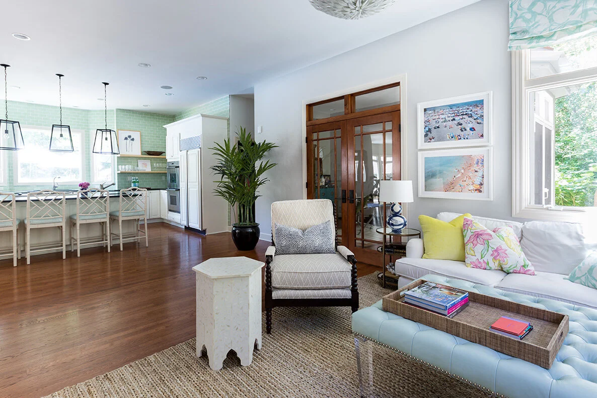
I’m so excited to share our refreshed living room reveal with you today! My motivation to update the space was our need for additional seating, especially since COVID has had the family mostly at home this year. In the photos below, you can see how much area between the living room and kitchen went unused.

 
LivingRm2.jpg
LivingRmBefore.jpg
 

In updating the room, I wanted to go bold with colors and patterns, and I “shopped our home” for all of the fun art and decor to pull the things together. I also had curtains made to replace the odd roman shade. For more insights behind the planning process, head to last week’s post here.  

Two pieces from two of my go-to art sources (Artfully Walls and Bridgette Thorton), perk up the lead-in wall to the living room. Our cornflower twist lamp “talks” to the  graphic Schumacher wallpaper in such a happy way.

 
JBD_NewMoon-6.jpg

Twist Lamp / Floral Art / Abstract Art

The two key pieces that were integral to transforming the space were the stunning Panthera rug, and elegant Milly sectional. The rug increased the width of the living space by 6’, enabling us to add both a small sofa that borders the kitchen, and the new larger, curved sectional sofa. Now we can comfortably seat seven people, whereas before, even four felt pretty tight. For everyone out there with an open floor plan, from big to small, it’s really the rug that builds the foundation for the space!

2.jpg
 

Sectional / Rug / Artwork / Lamp / Coffee Table (similar) / Fabric / Olive Pillow / Tibet Pillow

How sensational is this Panthera rug? It’s even more gorgeous in person! I’ve always wanted to incorporate an animal print rug into our home, but they can tend to overwhelm a space. The subtle chocolate on cream pairing is such an elegant take on a panther pattern, and it’s available with a built-in rug pad to boot! 

The Milly sectional is just as comfortable as it is beautiful, and cleaning up the occasional spill is a dream! After ordering five white performance swatches from Frontgate, my husband and I landed on the Sunbrella Linville linen. We love our last sofa (it’s headed to our lower-level media room), but the sectional is almost 2’ wider so it’s much more spacious for family lounging and entertaining.

 
JBD_NewMoon-10.jpg
 

Artwork / Lamp / Coffee Table (similar) / Side Table / Fabric

Speaking of new, I’m so excited to share our Jana Bek New Moon lamp! I was inspired by earrings I spotted on the host of the Spanish version of “Nailed It” for the shape (isn’t it amazing where you can find inspiration?). It took almost sixth months for us to get it right, and I’m so happy with its sculptural design!

JBD_NewMoon-11.jpg

New Moon Lamp / Olive Pillow / Tibet Pillow

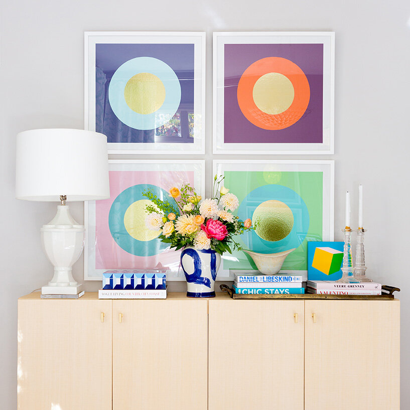
More of my favorite art really amps of the space. The graphic Arte Maison circle series, and a little square nugget from Gina Julian, replace the television that we rarely used. Our champion lamp rounds out the vignette and adds necessary illumination in these dark fall evenings.

 
JBD_NewMoon-8.jpg

Art Series / Lamp / Mini Art / Brushstroke Jar

The space feels so happy and vibrant now, and our family is delighted with result. I’m so looking forward to finally hosting some small family holiday celebrations in this happy room!

A special thanks to Marta Perez for her beautiful photography, and University Flower Shop for their stunning floral arrangements! The paint color is Cornforth White by Farrow and Ball.

For additional inspiration, follow me on INSTAGRAM, and PINTEREST!

 
Living Room Refresh the Game Plan

If you’re here for the first time, welcome! I’m Jana Bek, an Ann Arbor, Michigan based interior designer with a lifestyle line of home décor, textiles, & lighting. I have a love for bright colors, bold prints, and designing spaces & home décor that help transport you to your dream destination.


livingroomintro.jpg
 

This fall I decided to refresh our living room. I’ve always loved the design, but it lacked seating; especially since COVID has had the family mostly at home this year.

The constraint was our rug. When I first designed the space I was sure that any rug would prevent the adjacent French doors from opening. I also feared that extending the rug in front of the doors would look awkward. After years of living with a smaller rug, I finally realized how much it was impacting the space. In the photos below, you can see how much space between the living area and kitchen was not being utilized. After triple checking the measurements, I was confident that a larger rug would enable us to increase our living space by 6’ in width, plenty of room for additional seating that would border the kitchen. So, the hunt for lower profile rug options commenced!

 
LivingRm2.jpg
LivingRmBefore.jpg
 

Annie Selke is one of my favorite sources for beautiful and durable rugs (this will be our third from them), so when I discovered their new Panthera rug, a natural-hued take on a panther print, I crossed my fingers that it would work as the foundation for the room refresh. After ordering a sample, I was thrilled to see that it was just thin enough (even with its built-in rug pad!) to fit under the doors upon opening. Always order a rug sample, or the smallest size available, to review before purchasing the larger size you need. Then, if it doesn’t work out, you aren’t tasked with returning a massive, bulky package.

With the rug solution at hand, I delved into finding a larger sofa that would more comfortably fit three.

 
moodboard.jpg
 

Another item on my design “wish-list” has been a curved sofa, I love how they soften up any space. There are many options out there these days, but I always opt for performance fabrics (that’s why our other white sofa has stayed white for 10+ years)! Low and behold, Frontgate recently launched two curved sofa options and they have one of the best selections of performance fabrics in the game! Usually the Milly sofa would have been my pick, but I decided to go with the sectional option, because I knew it would serve for family lounging better. Great design needs to be functional and beautiful.

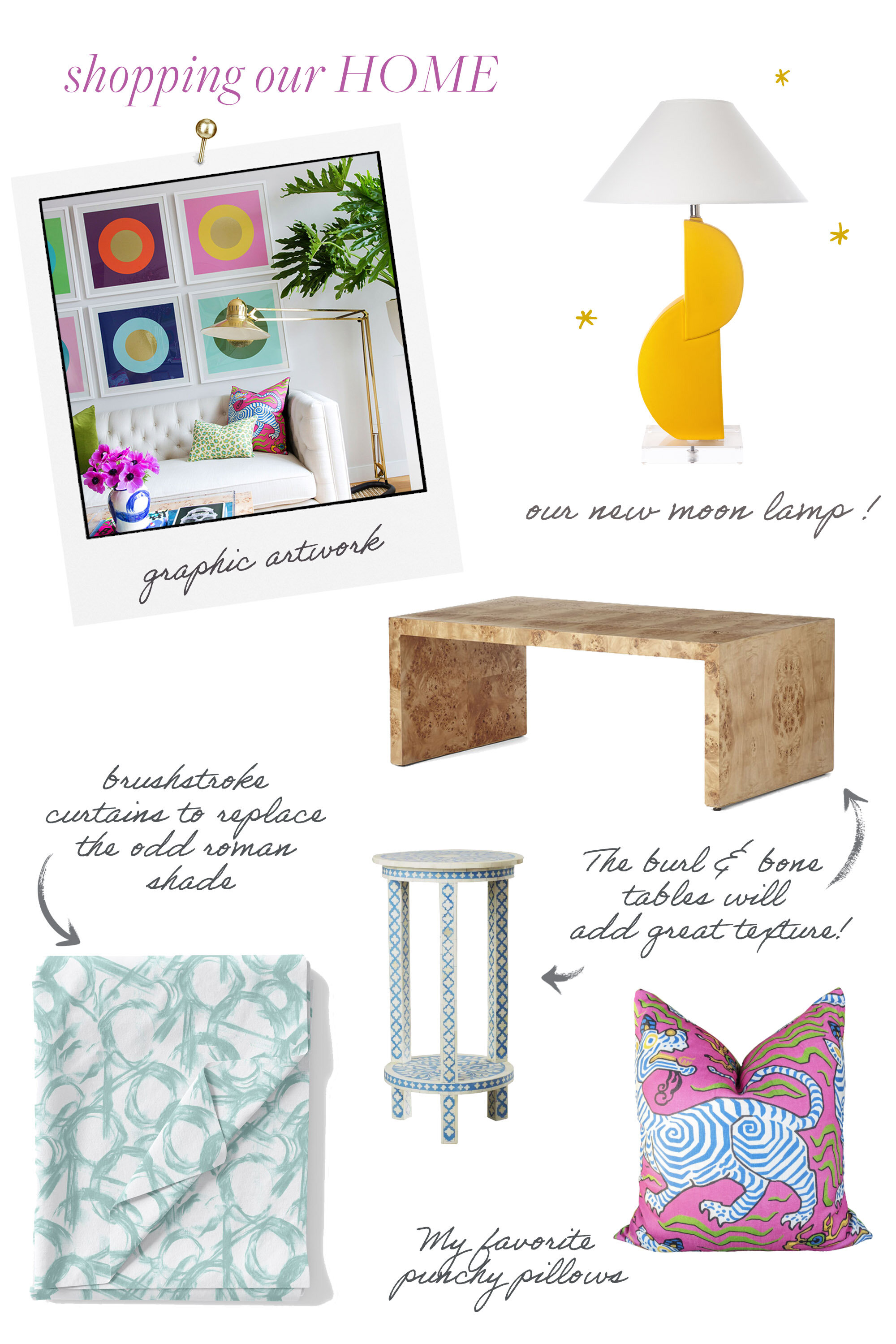
My design approach is to start with beautiful, neutral hero pieces, then to layer on the color and pattern with exciting art and accents. I’ll be “shopping” our home for the remaining pieces to punch up the space, here’s a round-up of a few items that I know will be making the cut!

 
roomup.jpg


The space coming together beautifully, and I can’t wait to share the reveal with you next week!

For interim inspiration, follow me on INSTAGRAM, and PINTEREST!

 
Room Reveal Master Bedroom Retreat

After making over our guest room last fall, I was inspired to shake things up in our master bedroom. I realized the airy, Zen vibe of the guest room was exactly what I was craving in our master.

CqbF5uEM.jpg

Here’s a look at it:Coupled with the fact that our room needed additional storage, and I wanted a proper bed, I knew this project was a perfect way to ring in the New Year!

Here’s what are room looked like before. We did like it, just wanted a more neutral palette, and again, some much needed storage.

VafU6O-Q.jpg
crfJwEGk.jpg

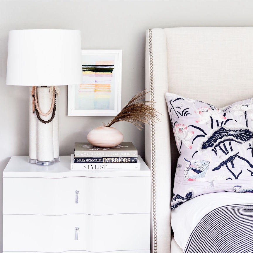
I had my eye on the gorgeous Frontgate bed for sometime, so that was an easy choice. I’ve always wanted a winged bed and I knew I’d enjoy its classic shape and nailhead detailing for years to come. Sadly, it’s now out of stock, but this one was a close second. Frontgate is one of the few companies I can purchase pieces online as their quality is consistently top notch.

fB_9eThE.jpg

To that end, I fell in love with their Gustavian chest, it’s timeless and beautiful. Living with it, I can confirm it’s crafted just as beautifully; it’s solid and heirloom quality indeed! Our emerald brushstroke lamp, paired with a lively jewel tone floral, pumps up the volume in this vignette.

MImImU68.jpg

From there, all that was required were fun aesthetic updates.  Matte stone is a finish offered in our new lamp shapes (it looks like cement which I adore), so I choose it for our clover lamps. I love the weight & texture they add to the nightstands!

5Hr9mhwo.jpg

Fittingly, a new Inslee figure study took the place of the blue one (also by her). I just love the lines and femininity of them.

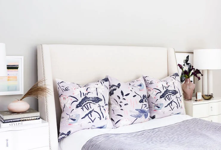
I had been pinning Schumacher’s Lotus Garden print for sometime, using it for few throw pillows, adds just enough interest while still feeling serene. A bolster in our blush brushstroke fabric adds a bit of whimsy and femininity.  

M3vvALDk.jpg

We are loving our refreshed retreat, it’s cool, calm and uncluttered. When life is as hectic as it is, I think a bedroom that feels like an escape is essential!

L9XWAfB0.jpg

For easy and impactful solutions, I always find that pairing down clutter, weekly laundering the sheets, and keeping a favorite candle on-hand; are ways that ensure a bedroom feels like a special space to unwind! 

ORC FALL 2018 REVEAL PT 2 - Son's ROOM

If you’ve been following along on my One Room Challenge, you know that for a few reasons I decided to makeover both our guest bedroom, and our son, Orion’s bedroom.

If you missed the guest room reveal last week, you can view it here. Zeb (my other stepson) was visiting from college last weekend and reported he dug the room’s vibe, and that the eucalyptus garland made it smell like California. Compliments from my stepsons are the best as they’re the hardest earned and indeed earnest! 

To that end, Orion is enjoying his updated space too. My favorite response from him was that he found the oversized scale of the flag with the brushstroke lamp to be a “pretty cool combo.”

Here’s a look at his room before:

1-1-1.jpg
1-2-1.jpg

And now:

OrionsRoom-2.jpg
OrionsRoom-1.jpg

Here’s why his room works:

Headboard 

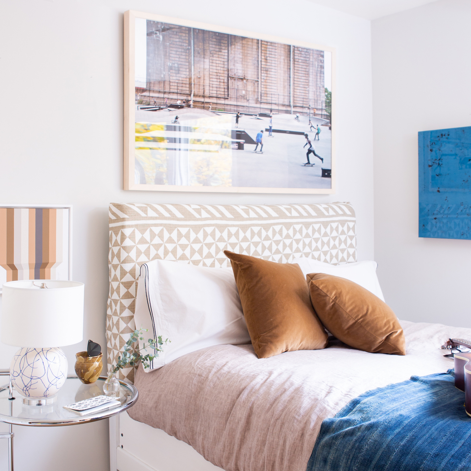
His palm headboard was quite fun but on the youthful side for a 17 yr old. Reupholstering it in Schumacher’s Nuba fabric was the perfect solve. There’s so much movement in the pattern, it’s energetic yet sophisticated, and luxuriously thick. Now it’s a bed he can take with him to college.

OrionsRoom-3.jpg

Art

Both of our sons love to skateboard & I was thrilled to find this skateboard park scene captured on Artfully Walls. It layers in the street vibe, and is the perfect piece to tie together the loose theme of the room.

Art.jpg

I choose our mini blue scribble lamp for the nightstand to highlight the blue in the skater’s shirt. I love the small scale of the lamp in this space too. The fun op-art is by my talented friend, Gina Julian.

OrionsRoom-5.jpg

I’ve also always adored the spirit of Kristi Kohut’s pieces. I knew her “Leave a Big Mark” would add the color and energy the space needed to feel authentically cool. I already know it will be making appearances throughout our home.

Rugs

I don’t love the carpet but wasn’t up for replacing it just yet. A flea market cowhide rug, layered over a sisal we had in storage, hits the right balance for this relaxed space.

I’m so happy with how the spaces came together that they’ve actually inspired me to refresh our master bedroom! I know it will be small tweaks but I’m already excitedly planning! I hope you’ll stay tuned, and you can always follow along with my scheming on Instagram and Pinterest!

All photos by Marta Perez, styling assistance by Emily Schoen

ORC-Guest-400white-1.jpg