One Room Challenge Spring 2019 - Week 2
If you’re here for the first time, welcome! I’m Jana Bek, a New York and Ann Arbor, Michigan based interior designer with a lifestyle line of home décor, textiles, & lighting. I have a love for bright colors, bold prints, and designing spaces & home décor that help transport you to your dream destination.
I’m so excited to be included in my ninth season of One Room Challenge! If you’re just tuning in, I’m designing our new one-bedroom Brooklyn apartment for this season’s One Room Challenge, you can catch up on links below:
Challenge 1: Offset windows and embedded H/C Units
This week we’re talking about the awkward challenges our apartment’s layout pose & and ways in which I’ve decided to tackle them. This combined culprit is a doozy, it’s so off-balanced! The windows are not symmetrically placed with respect to the walls, and the shortness of walls tend to “call out” the asymmetry. On top of that, the windows include an H/C unit that stand from the floor to the lower windowsill.
Here’s my plan to turn these challenges into strengths:
I’ll bring balance to the asymmetry by adding weight to the larger corner with a properly sized plant that pops instead of blends.
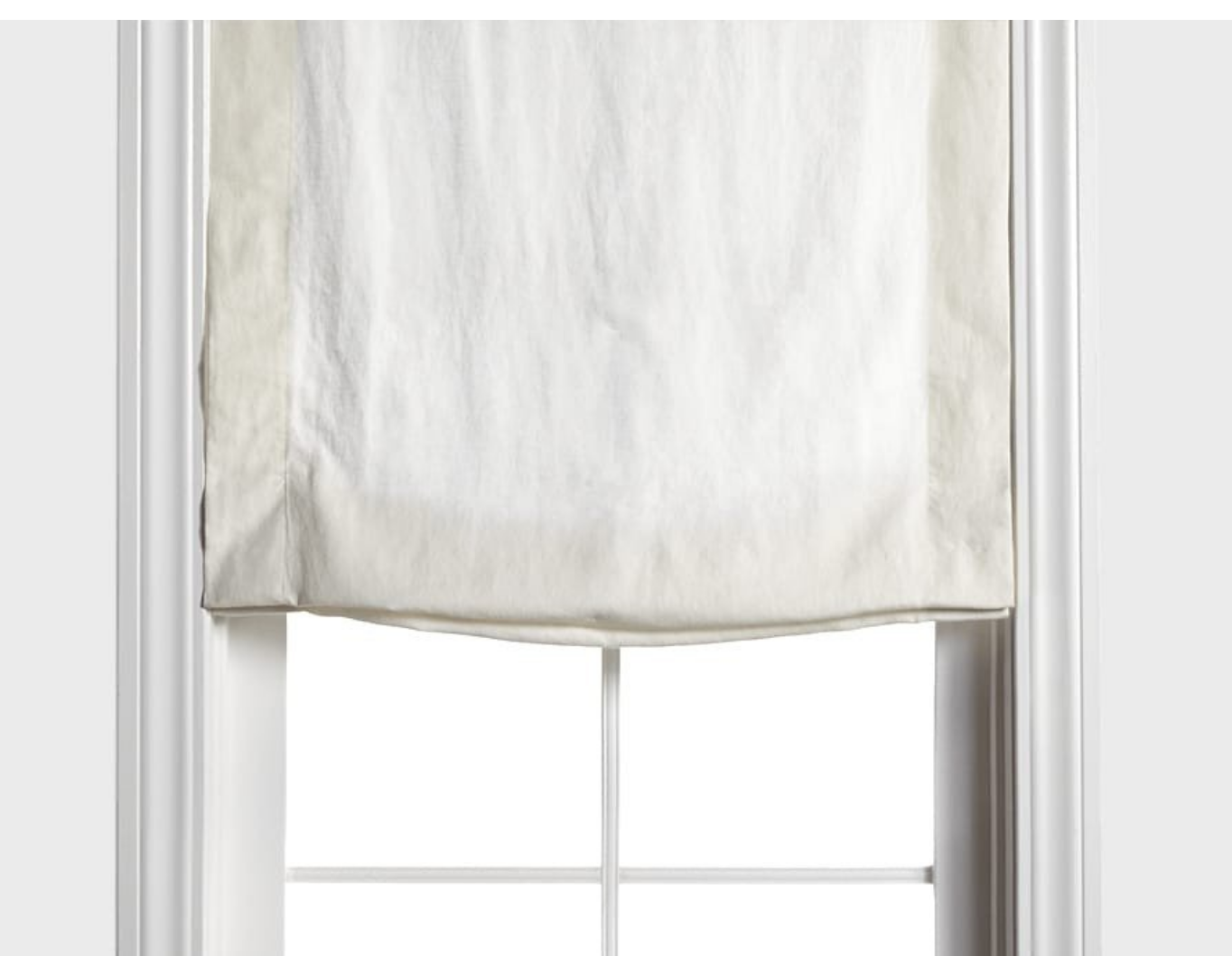
For the window itself, I’m so very lucky to have Barn & Willow as an ORC sponsor! Their roman shades won’t overwhelm the window, but instead will draw you into the scene. Simple, sophisticated, and great fabrics and function. As a bonus, this will hide the standard apartment roller-shades without losing their functionality in case I want to block additional early morning light.
The top of the H/C unit is large enough for what I plan to be elegant, but unassuming styling details. This, I think, will make something that looks accidental into something that looks purposeful.
Challenge 2: Wall Corner into kitchen
This complex corner must be hiding duct work behind the walls, but regardless of the reason, it’s simply unattractive! What immediately came to mind was a large folding screen. I’ve wanted one ever since I was a girl, and now I have the perfect reason. It’s exactly what I need to hide the funky architecture and at the same time frame in (and create) a small dining area between the living room and kitchen.
Challenge 3: Storage
Small-space living means always layering in an opportunity for storage! Luckily, our walkway from the entrance/kitchen to the living area is just wide enough for a cabinet – I’ve got my eye on Ballard Designs eye-catching Adele Cabinet. I’m a sucker for grass-cloth when it’s done right, and Ballard is doing it very right. Just in the middle of confirming that the timing will work out!
Challenge 4: Bedroom and Closet
The bedroom itself doesn’t pose many challenges, and by city apartment standards, our closet is big; but there’s no foldable storage. The room is too tight for a dresser across from the bed, but I found a solution in the small hallway just before our bedroom door. I think the dimensions work just work out for a sleek tall chest from A.R.T. Furniture that offers lots of storage in a small footprint. Perfect pick for the perfect solution!
Next week I’ll be sharing my firmed-up furniture designs and running you through my textile and art choices, some very exciting design decisions will have been made! For my interim planning, check in on Instagram (@janabekdesign) & Pinterest!


